
5 Effective Ideas For Building Your eCommerce Landing Page
The key ingredients in building eCommerce landing pages are offering value, providing answers, and ensuring a smooth user experience. These elements make sure you win your prospective customers and take them on a smooth shopping journey. Today we’ll show you how to design a compelling landing page that will captivate your audience and drive impressive results.
We’ll explore the critical elements that make an eCommerce landing page convert. Using the right elements and a deep understanding of your target audience, you can build landing pages that drive impressive conversion rates. Additionally, we’ll help you define your landing page’s purpose and provide best practices to follow. You’ll find plenty of real-life examples to guide you along the way.
Ease your mind that you’ll learn the right combination of design and persuasive elements to use after reading this article. Let’s begin.
5 Proven Strategies To Design A High-Converting Ecommerce Landing Page
An eCommerce landing page is the first page visitors see. Make sure to impress and convince them to explore further and take action. Here are proven strategies you can implement to transform your landing page into a captivating and high-converting destination.
1. Write A Clear & Compelling Headline
A clear and compelling headline immediately grabs their attention and encourages them to explore your offers. As a rule of thumb, a headline should be straightforward. One look and the visitors should understand what they can expect from the landing page and how it will benefit them.
Make sure you use language that everyone can easily understand, regardless of their background or level of knowledge. When visitors easily grasp your message, they are more likely to stay and read further. Here are some best practices to create a strong headline:
- Keep it short: A concise headline achieves a higher impact on the audience. So, make sure to maintain your headline within 30 to 60 characters (around 6 to 12 words).
- Personalize it: You can tailor each headline based on your prospects’ pain points, desires, emotions, and preferences. It will make it more relevant and relatable.
- Use action-oriented language: Action verbs are known for creating a sense of energy, urgency, and engagement. Add the right one to your headline to make it more persuasive, encouraging visitors to take immediate action.
Going is a real-life example of a travel-related brand that excels in writing excellent headlines. Let’s analyze their headline to understand why it works so well.
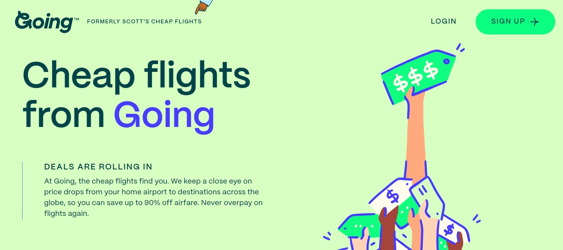
The headline captures so much attention because it addresses their target audience directly – budget-conscious travelers. They mention the word flights and emphasize cheap to position themselves as the go-to place to find the most affordable flight deals.
Their headline’s straightforward nature also helps instill trust in their service. It clearly states what the subscribers can expect, which is crucial in attracting potential customers. The headline is also supported with a short description to give more context to their offer. Lastly, the calls to action emphasize their service’s convenience – sign up to receive handpicked deals directly in their email inbox.
2. Add High-Quality Visuals
The compelling headline captures and draws the potential buyer’s attention to your content. But the strategic use of visuals is what solidifies the impact of your content and encourages engagement or conversion.
Visual has the power to reinforce the text and tell a captivating narrative concisely and compellingly. The key is to choose the visual elements that complement your content the most. It will make your content more accessible and easier to understand. Let’s explore different types of visuals, including their purpose and impact on eCommerce landing pages.
2.1 High-Quality Product Images
Since physical inspection is not available, high-quality images are a great substitute for the in-store experience. It helps eCommerce businesses provide potential buyers with an accurate representation of the item’s appearance, design, and features. Shop Solar sets a good example for providing detailed and high-resolution product images for their solar power kits.
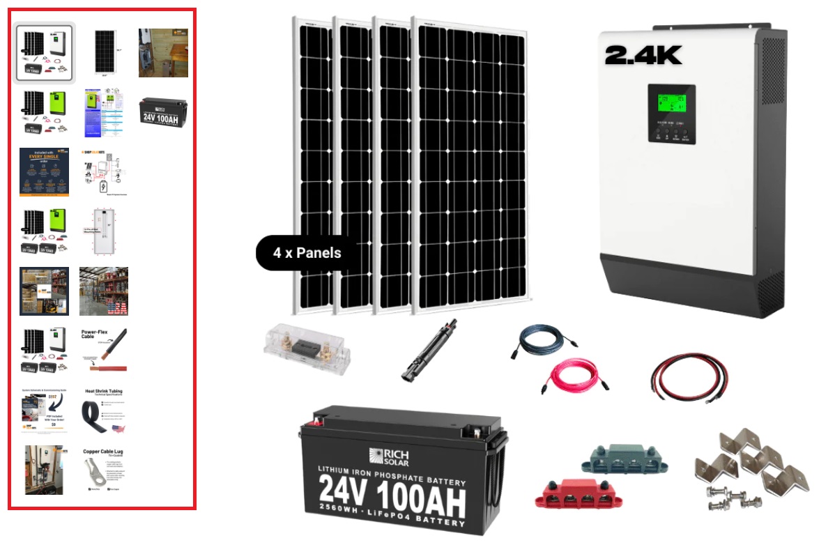
The screenshot above represents the brand’s eCommerce product landing page for complete solar power kits. They capture it in high-resolution to magnify the product’s intricate features and textures. Everyone can zoom in to take a closer look. This clarity helps build confidence in the product’s quality and encourages potential buyers to purchase.
The default image shows all the parts included for a specific off-grid solar power kit. But they also include individual images (battery, solar panels, cable, etc.) to show each part’s details and materials. They even include an installation diagram and actual setup to display:
- How to install the kit
- How the components fit together
- And how the system operates
Another best practice to implement is capturing the product from different angles. It allows potential buyers to see the product from different perspectives and understand the product’s dimensions and design.
2.2 Graphic Design
If you want to show more of your brand’s artistic vision and ideas, you can add graphic design. It’s the strategic process of combining visual elements to create a custom-made design. Consistently using it will make your brand memorable and communicate the information you present effectively. Additionally, with its compact design, it makes it more shareable on all online platforms.
Apple Inc. is a popular brand that consistently incorporates graphic design into its eCommerce landing pages. Their philosophy revolves around simplicity and minimalism. They understand that simple and clean designs are more effective in conveying the intended message clearly. It also guides the viewer’s attention, preventing confusion and user disengagement.
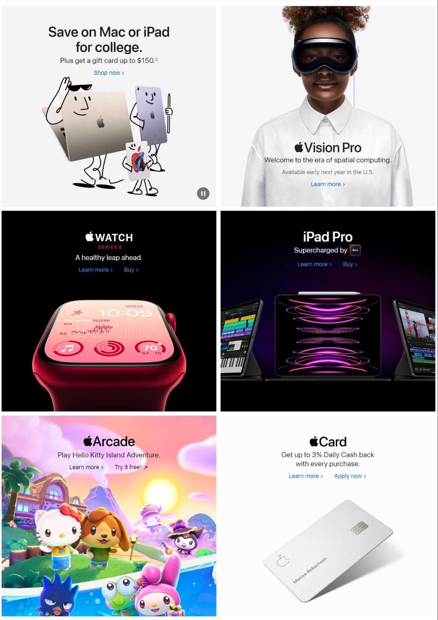
Its iconic logo is one graphic element that stands out. The half-bitten apple represents the core attributes of its brand identity – simplicity, innovation, and elegance. This is important to apply this because it will help your brand be easily recognizable and stand out from your competitors. Apple matches its logo with the following graphic elements:
- Typography: They chose to use the San Francisco typeface; highly readable, even at small font sizes.
- Color Palette: They use white, black, and grayscale shades to create a modern and sophisticated look that aligns with their product design.
- Iconography: They employ simple and intuitive icons to represent various functions and features on their landing pages. This makes the user interface easy to understand and navigate.
- Interactive Elements: Apple also incorporates interactive elements to provide an immersive user experience. Product animations and video demonstrations are a few you can expect to see. You can make these with any animated video maker, there are many available these days.
The good news is, you too can achieve Apple’s success. All you need is to experiment with colors, images, layout, and typography to create unique and visually striking compositions. While experimentation is encouraged, resist the temptation of overdesigning. You can create a visual hierarchy and maintain proper alignment to create a sense of order and unity within the design.
2.3 Infographics
Infographics are perfect for presenting intricate data, statistics, processes, or concepts and make them easier to understand. The goal is to simplify the information so that even those without specialized knowledge of the subject matter can understand it easily.
You can take DS Stream for inspiration. It’s an IT consulting company specializing in Data Engineering and Data Science. It uses infographics to explain how Big Data solutions and advanced analytics work.
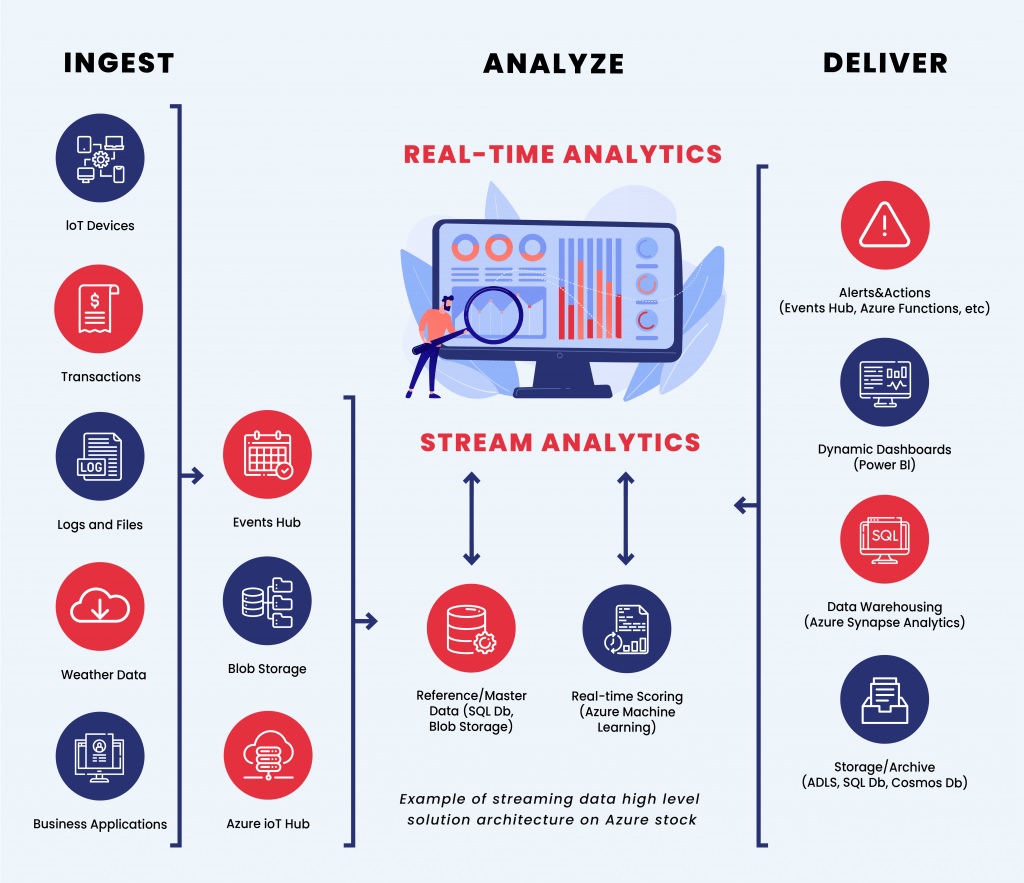
The infographics above show how they explain the data streaming process – from production to reporting. Through this data visualization, your readers will understand how data flows seamlessly from its source to the reporting stage. As a result, they can make timely decisions on how to optimize their processes, improve products, and enhance overall performance.
This concept will also work well for machine-to-machine technology guides. Suppose you want to guide your readers on how to stream data from Postgres to Snowflake. You can use infographics to illustrate the connection between the Postgres database and the Snowflake data warehouse.
Some topics you can highlight are the step-by-step procedure of the data extraction from Postgres, transformation for compatibility with Snowflake, etc. You can include the following visual elements to add value to the learning experience:
- Icons to represent each stage
- Informative text to provide context
- Graphs or charts to show data volumes or performance metrics
Infographics are versatile graphic designs, which means you can use them for a wide range of purposes. Medical Alert Buyer’s Guide uses it to present its product reviews in a visually engaging and easily digestible format. The screenshot below presents their review of an in-home medical alert device.
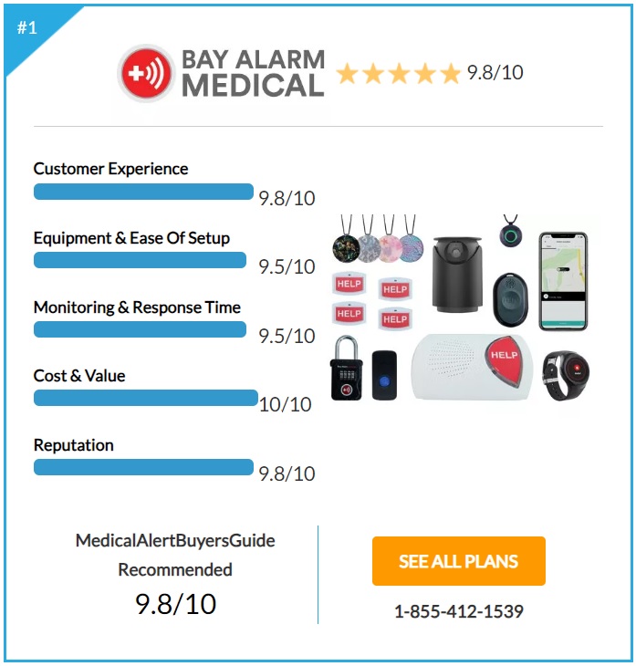
The review includes vital information to help readers make informed decisions, covering everything from customer experiences to reputation. It features a clean design with a white background to provide a professional look and allows the product to shine. Plus it can also ensure that readers can easily focus on the information.
They also add a yellow star icon to highlight the customer review rating. Lastly, a strategically placed call-to-action button below the product’s image aims to convert visitors into happy customers. If you’re comparing multiple products, a side-by-side comparison chart is ideal to add.
3. Use Engaging Videos
Did you know that adding engaging videos to your eCommerce landing page can increase your conversions by 86%? Many content marketers and digital creators take advantage of it because of its unique ability to tell stories that evoke emotions effectively. So when customers see professional and informative videos, it helps them build trust and confidence in the business and its products.
It doesn’t take much efforts to make a video online nowadays. You can simply attract more buyers if you do it. Choosing the right type of video can enhance the overall user experience. Make sure to align your video content with your audience’s preferences, conversion goals, and marketing campaign strategies. Let’s explore some of the different types of videos commonly used in eCommerce landing pages to inspire you.
3.1 Product Demonstrations
Demos are video presentations that show your product in action. Its goal is to address potential doubts and prove that the product performs as advertised. Most brands use demos to showcase their product’s features, including how it works and what it can do. Reclaim.ai uses the same approach to introduce each feature of its AI scheduling automation app.
The product demo includes a clear and friendly narrator’s voice to establish a connection with the audience. They feel more comfortable and at ease while watching the demo. It also includes a clear call-to-action (CTA) at the end of the video to encourage viewers to take the next step. For the task feature, the CTA is connecting the app to their Google calendar to sign up for free.
Product demos are versatile. You can add it as a visual element to build an effective landing page design. But you can also add in any of your web pages, like a blog. Since Reclaim.ai can sync them to track and schedule any tasks seamlessly, they can add the video to their performance review guide.
Here, they can show how the app can help business owners orHR personnel in conducting performance reviews. They can also brainstorm on how to improve the review process. You can write each task directly from Slack to make sure you won’t miss anything important.
3.2 Customer Testimonials
Testimonial videos are an ideal option because of their authenticity and credibility. Since it features real customers speaking about their actual experiences, viewers perceived it as more genuine and trustworthy than traditional advertising. As proof, Trustmary states that 2 out of 3 consumers are more likely to purchase after watching a testimonial video.
You can take Catena for inspiration. Most of their customers share their challenges and mistakes in hiring the wrong candidate. Then, they will highlight how the brand helps them with the recruitment process – matching a professionally-trained candidate for the job. It saves their time, effort, and money.
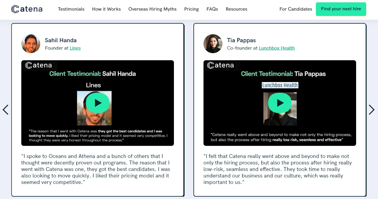
Here are other key points that people typically mention in customer testimonials:
- Positive experiences with customer service
- Leave a strong recommendation for the product or service
- Compare the product or service to alternatives they have tried in the past
3.3 Brand Stories
People make purchasing decisions based on emotions and personal connections. Humanizing your brand will help in creating a stronger bond with your audience. Sharing your brand story is an excellent way because it creates a sense of community. Plus, it sets clear expectations for customers about your brand’s core values and mission.
ADPList is one brand with an inspirational brand story. It’s an online mentoring platform driven by a passion for nurturing the next generation of designers. They believe with the right collaboration and mentorship, they can unlock the full potential of every designer.
The brand story above centers on the mentors’ past challenges and experiences, and how they help each other to grow. But most of all, they share their love for mentoring. They willingly volunteer their time and expertise to mentor others. This sense of community is what makes ADPList stand out within the design industry.
ADPList’s brand story continues to evolve with each new connection made and every success story shared. It’s a story of empowerment and growth. If you’re in the same field, you can create a brand story like this. But if not, there are different types of online mentoring platforms available designed per business type and industry.
4. Compose A Persuasive Copy
Once the headline captures your audience’s attention, the persuasive copy will guide them through the sales funnel. It strategically communicates the benefits, value, and unique selling points of the product/service or the offer you’re promoting. Ultimately, convincing them to take the desired action.
Since you’re writing a copy for eCommerce landing pages, make sure to keep it short and simple. How short should the copy be? A general rule of thumb is at least 500 words. It’s a sufficient amount to discuss the most critical information about the product and address common questions. If you’re writing for a promotional landing page, 300 words are its minimum requirement. A good example of this is Pumpkin® Pet Insurance.
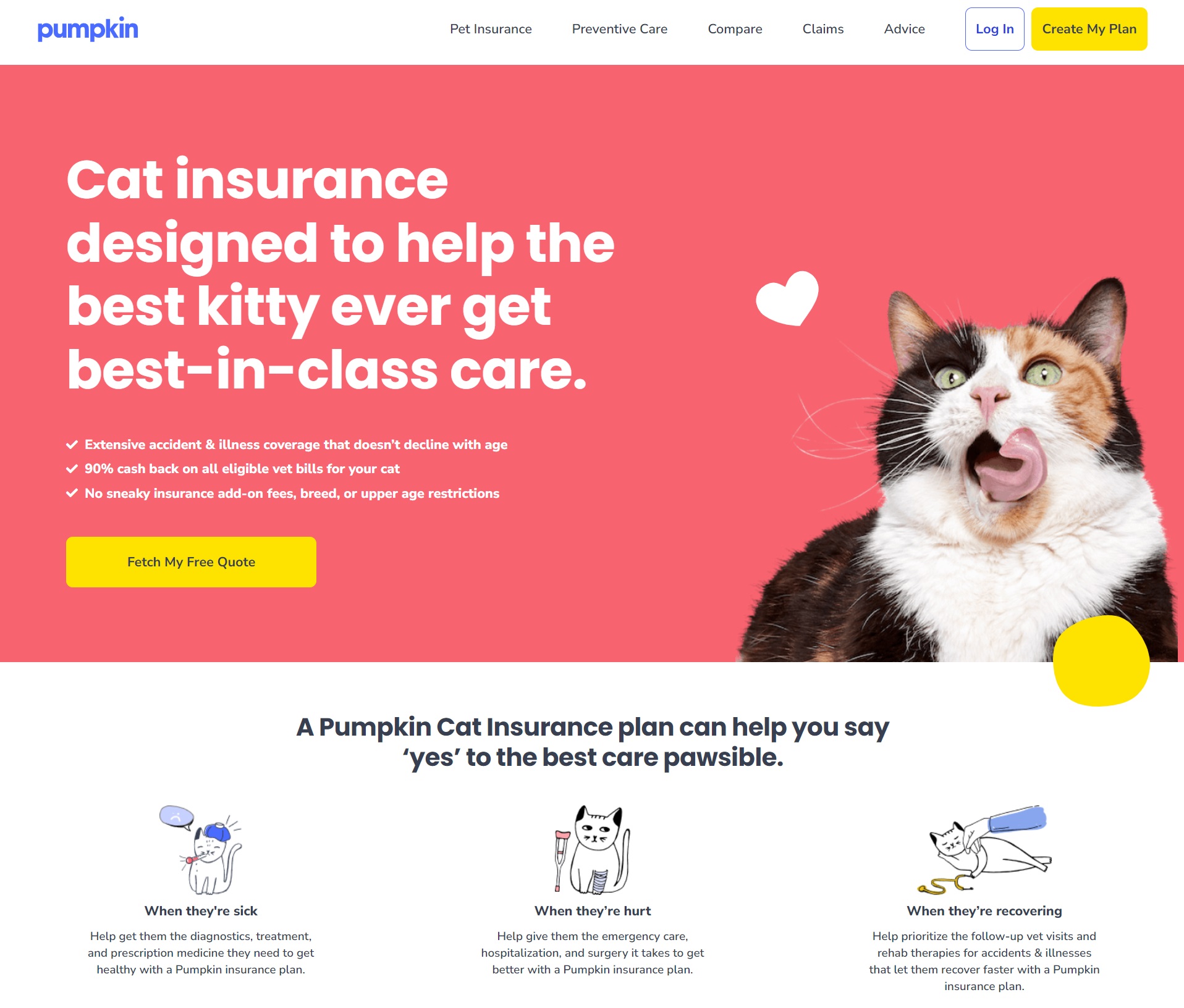
The copy uses short paragraphs, bullet points, and subheadings. All elements make the copy easy to skim and digest. It also offers a 90% cashback incentive to ensure they will convert their visitors into customers.
It also answers the most important question, What’s in it for me? At a glance, readers know what benefits you’ll get from this cat insurance plan. This includes the plan’s coverage (accident and illness), proper cat care, and a side-by-side comparison to other insurances.
5. Strategically Place A Call-to-Action (CTA) Button
The CTA button is the final push you give to your visitors so they’ll take the specific action you’ve set. The simplest CTA button you can add is for inviting visitors to join your email campaign. Its clear and straightforward message makes it effective in encouraging visitors to subscribe to your email list. You can never go wrong with it.
But for the eCommerce landing page, it isn’t enough. There are a lot of things going on on the page that you need to address. You can lose some good opportunities if you haven’t planned it well. One brand that does it right is Flippa, an internet marketplace platform for buying and selling online businesses.
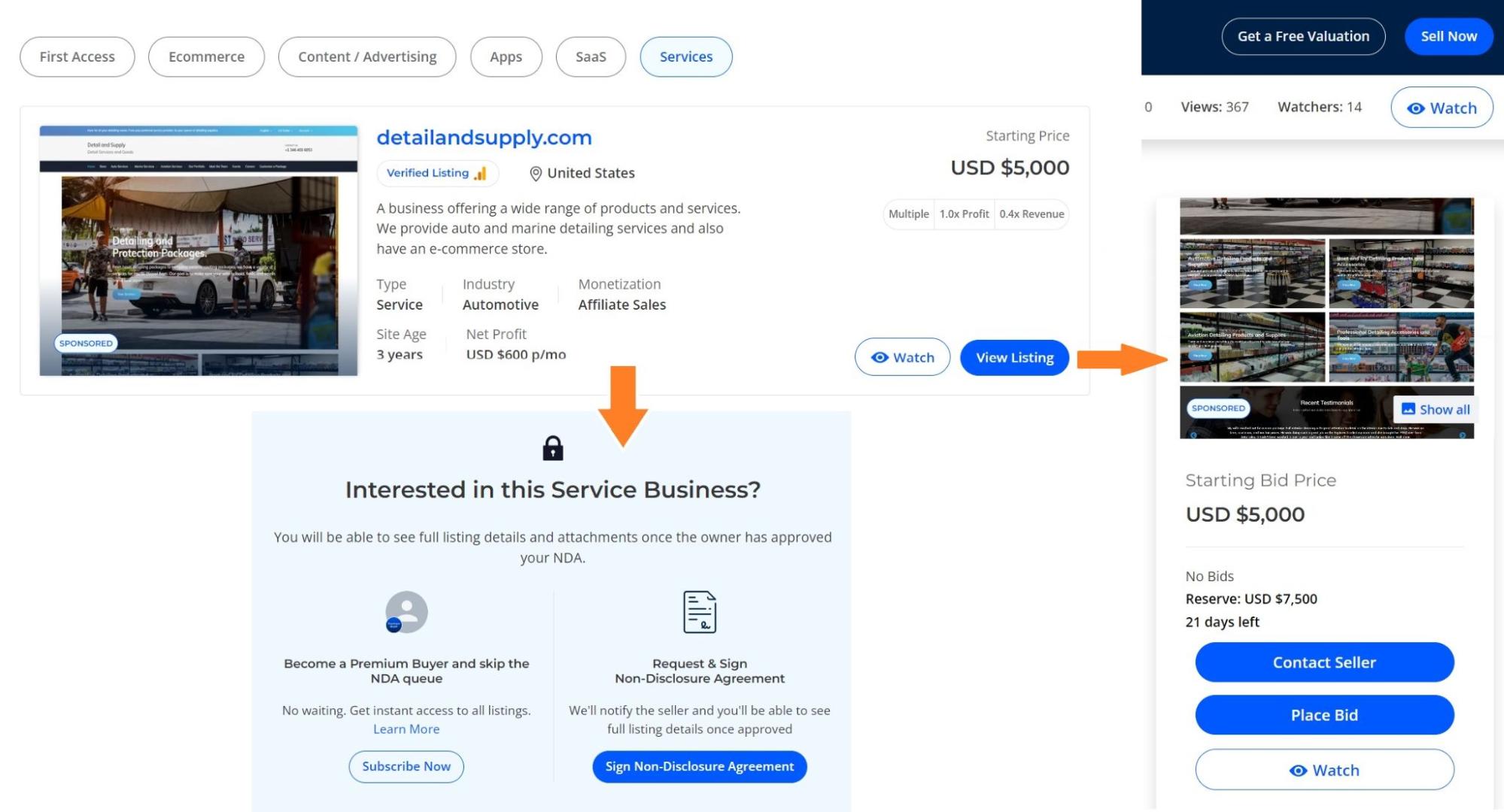
Its CTA buttons feature a simple design with a combination of blue and white backgrounds, making them visible and attention-grabbing. They may have a wide range of products, but the brand ensures consistency in the design and placement of every single product page. On the main listing page, you’ll see two CTA options:
- View listing: See the complete details of a specific business listing
- Watch: Receive daily updates on your favorite sellers’ listing activity
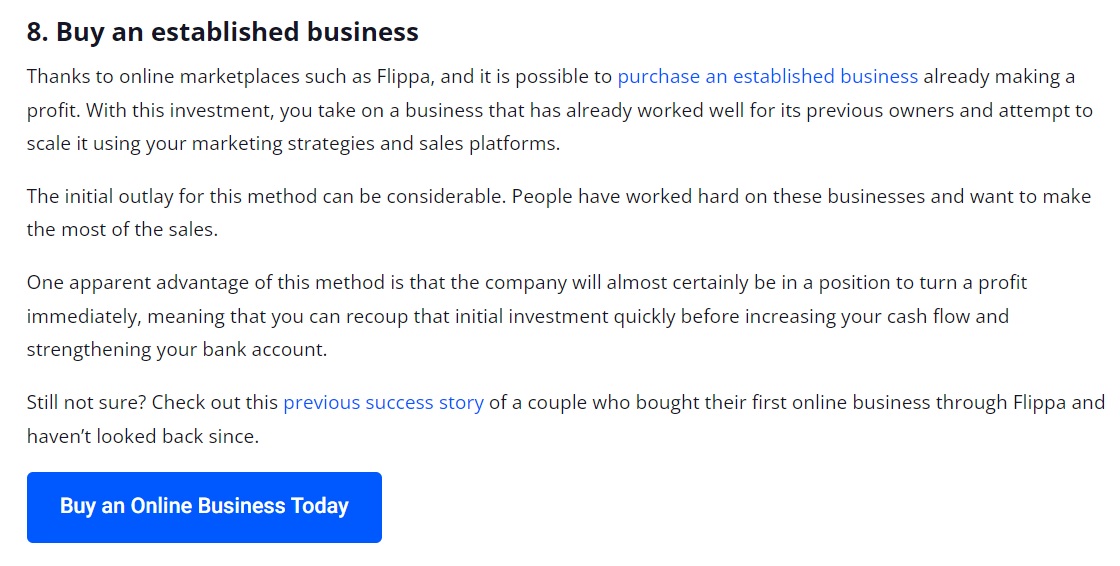
The ‘view listing’ will give you more CTA buttons to help you make a decision. Contact sellers, place bids/make offers, and sign a non-disclosure agreement are a few to name. Flippa understands that a blog is also a great place to connect with readers. That’s why it places a CTA button on relevant blog posts. Readers can go straight to the eCommerce landing pages if they find it interesting.
A good example is its blog post about building wealth (turning 10k to 100k). As the post discusses smart ways to invest money, Flippa placed the “Buy an online business today” button under the Buy an established business topic.
Conclusion
Creating a successful eCommerce landing page requires careful attention. It’s important to be fully aware of the important elements that boost its user experience. While experimentation is encouraged, you should balance the design between creativity and simplicity. A simple and clean design is more effective in conveying the intended message clearly.
You should also deliver a sense of professionalism and credibility. People are more likely to engage with the content and consider the offer of a trustworthy brand. Additionally, ensure mobile responsiveness. Optimizing your eCommerce landing page for different devices ensures all visitors have a seamless and enjoyable browsing experience.
Unlock your eCommerce potential with CS-Cart’s online store builder. Visit our website and explore our professionally designed landing page templates to create a stunning and high-converting online store.
Burkhard Berger
Burkhard Berger is the founder of Novum™. He helps innovative B2B companies implement revenue-driven SEO strategies to scale their organic traffic to 1,000,000+ visitors per month.