Top-5 Best-Practices of an Ideal eCommerce Landing Page
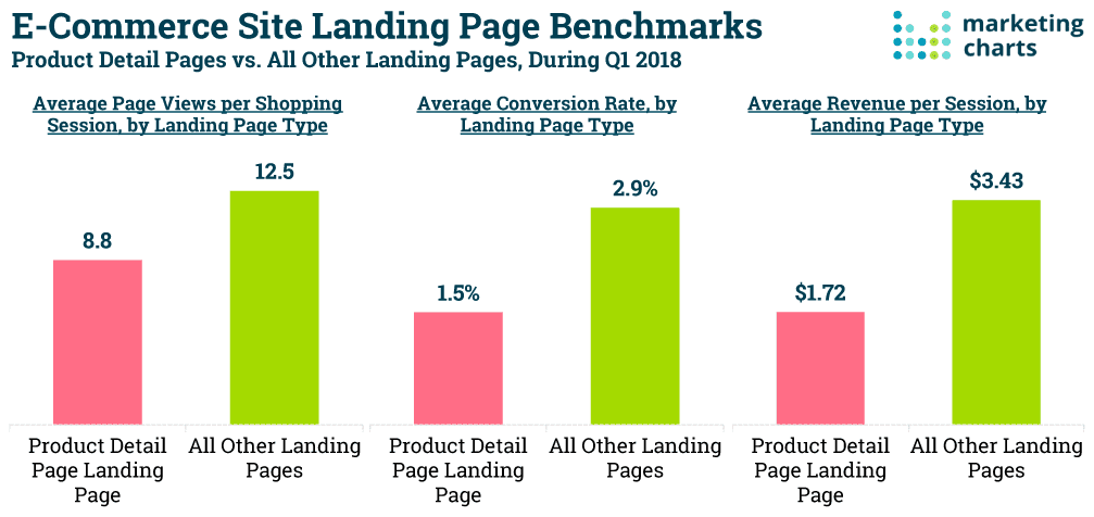
Ever wondered what role does your eCommerce landing page plays in your overall conversion rate goals? Consider the following statistics which highlight the importance of a Landing Page vs. a Product Page:
- 42% page visits for visitors who land on a product page view than those who see a post-click landing page.
- Post-click landing page visitors convert at double the rate than product page visitors (2.9% and 1.5% respectively.)
- Revenue per session for post-click landing pages stands at $3.43, whereas for product pages, the revenue rate is $1.72 per session.
The moral of the story is the same: Optimizing your landing page can reap huge financial, conversion, and marketing benefits. If you’re wondering about where to start, keep reading.
What makes for an Ideal eCommerce Landing Page: Top-5 Aspects
1. The Page should be Technically- & SEO-Optimized
First things first, it is critical that you check your landing page’s:
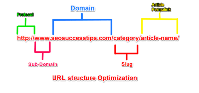
- URL Structure Optimization: It is essential that your URL structure is SEO-optimized for search engines. As you can imagine, this boosts your PageRank and improves the user experience by leaps and bounds. Another handy tip that you should keep in mind is that you should use short URLs as they tend to rank higher on Google’s first page – a priceless advantage! Plus, make sure that the URL is organized. For instance, go for a URL structure such as:
www.cherries.com/blogvs.
www.blog.cherries.com- Page Speed: Get this—If your page’s loading time is longer than 2 seconds, you can say goodbye to your customers! Here’s what Google has to say in this regard:
“Two seconds is the threshold for eCommerce website acceptability. At Google, we aim for under a half-second.”
Luckily, there are website speed test tools such as Google PageSpeed Insights, which allows you to check how long it takes for your website to load.
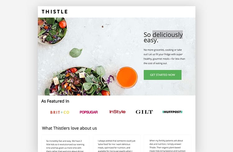
There’s another element that deserves a special mention: Your website should be mobile-optimized as well. Take Thistle‘s landing page, for instance:
Research by Google claims that “When people have a negative experience on mobile, they are 62% less likely to make a purchase from your brand in the future.”
Handy tip: When optimizing your landing page for the mobile, don’t forget to factor in tablets as well.
2. Chatbot Integration for Real-Time Support is a Must
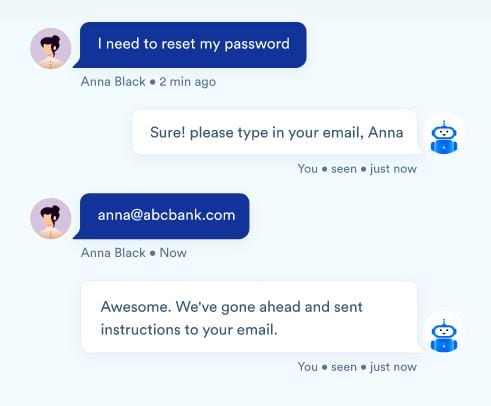
Chatbot integration has become necessary for keeping your users happy, satisfied, and loyal to the brand. And for a good reason. Let’s look at the other benefits chatbots pose:
- They can help you capture leads by storing useful visitor information such as name, email address, contact, etc.
- They help boost your engagement by providing instant and 24×7 support for user-related queries.
- They extend a seamless user experience and, by extension, enhance conservation rates.
Here an example of a successful chatbot integration to take inspiration from:
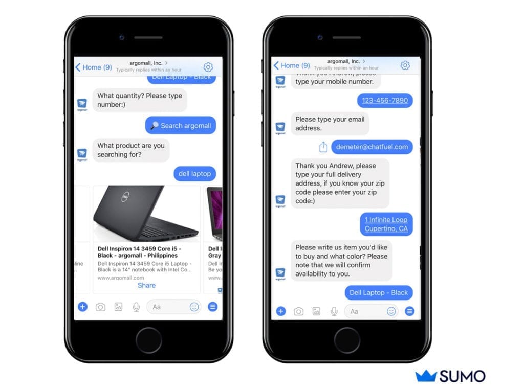
- Argomall is an eCommerce store which uses a chatbot to sell consumer goods, streamline the sales process, and enhance the live chat and support experience:
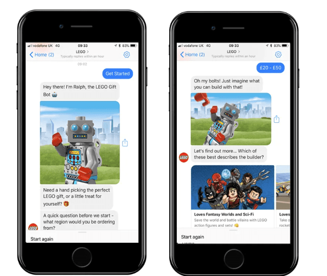
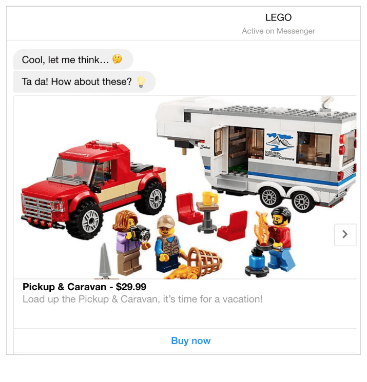
Another brand that’s made huge strides by chatbot marketing is Lego. The chatbot – Ralph – suggests gift options based on how a user answers questions relating to key data such as location, age, and gift budget.
Once the details are in, users can hand-pick a theme of their choice such as adventure, travel, and narrow down on a product they like which automatically gets added to their shopping cart. The process is detailed yet convenient:
Key takeaway: All in all, chatbots can become your landing page’s eyes and ears, entertaining users, and educating them as they navigate through your landing page. They act as an integrated customer service tool and offer instant results.
3. Invest in UI/UX Optimization
A landing page that’s not UI/UX optimized is targeting users ‘blind.’ That is why focusing on your landing page’s User Experience (UX), and User Interface (UI) is critical.
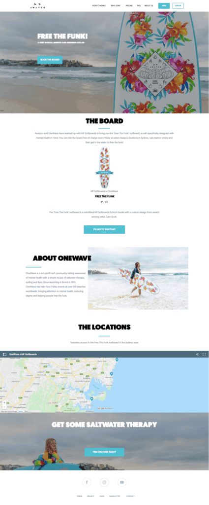
Awayco‘s website has a seamless and convenient UX by offering users important information such as a map to show rental locations. This makes the booking process a breeze:
At this point, it is important to remember that you need to:
- Constantly update your landing page’s design from time-to-time to keep it modern and fresh!
- Have a responsive landing page that doesn’t take forever to load. Avoid inserting too many videos.
- Keep the content engaging and relevant. At all times, make sure to highlight the value-add your website is offering to the user to keep them hooked and coming back for more. Incentives such as free shipping, return policy; and discounts/deals go a long way!
- Make sure that your navigation is simple, intuitive, and user-friendly.
- Provide flexible payment methods and avoid forcing people to sign up.
- Have a single-click checkout page with a clean look-and-feel.
- Always offer a guest checkout experience.
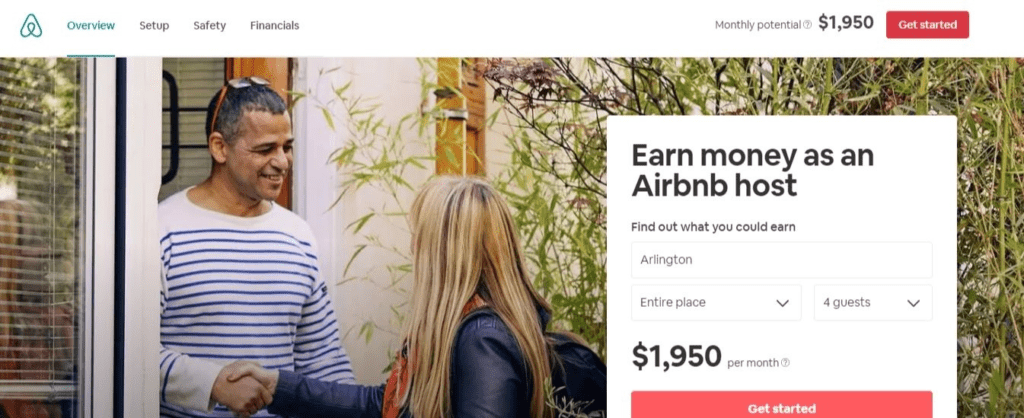
Look for ways to make the landing page experience more interactive as Airbnb does by including a specific dollar amount to demonstrate how much hosts can earn by renting their property:
Handy tip: You can use the CS-Cart Multi-Vendor marketplace platform, a standalone eCommerce software, which acts as an online marketplace. As a marketplace owner, you can invite vendors to sell products through a single storefront and engage in seamless selling experience.
4. Ad Copy & Landing Page Content should be Relevant
When it comes to the content on your landing page, here’s the golden rule: Highlight your product’s key USPs, talk about how your product/service can benefit your customers, keep the information relevant, and definitely mention the price.
By demonstrating the value your product/service offers, you can keep your customers engaged. Plus, personalized ad content can ensure that your ads are more targeted, relevant, and twice as likely to convert.
Handy tip: Make sure to break your content into smaller sections, complete with neat headers and bullet points to make it easily digestible.
5. Call-To-Action Buttons should be Working
Popularly, the CTA button on an eCommerce landing page should have a singular goal: To motivate visitors to perform an action – It could be filling a form, purchasing the product/service, downloading data, or calling the company.
That said, performing A/B testing to check which elements are working and which are not is key. Also, make sure to put a search bar on top to help users in case they get stuck.
Moving on, let’s look at an effective example of a website with a clear CTA button: WaterDrop

Notice how your eyes effortlessly wander to the “Buy Now” white box. This, in essence, acts as a CTA button, encouraging you to connect with the brand and purchase the products. So, if you are integrating a CTA button on your landing page (which you should), ensure that it’s always working! Nothing annoys customers more than seeing an ‘Error message.’
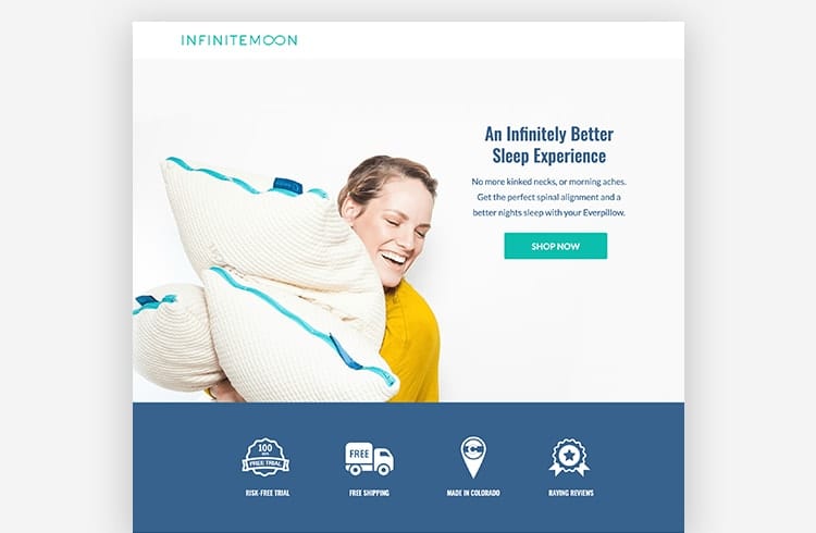
Another website with a stellar landing page and a clear CTA button is Infinite Moon:
The ‘Shop Now’ button is clearly visible and is not overwhelming for the visitor or too salesy in approach.
Final Thoughts
Clearly, there’s more to an effective landing page than larger-than-life images and big logos.
Landing pages are, for all intents and purposes, a virtual equivalent of a first impression. You can either make a great first impression or a devastating one depending on how many elements you ticked off from the list above. Try these strategies and transform your website’s landing page into a conversion-churning machine!

Yan Anderson is the Head of Content Marketing at CS-Cart with over 10 years of experience in the eCommerce industry. He's passionate about explaining complicated things in simple terms. Yan has expertise in building, running and growing eCommerce marketplaces. He loves to educate people about best practices, new technologies, and trends in the global eCommerce industry.
