
Best Ecommerce UX tips Google actually recommends for CRO
Google is famously reserved on giving advice for webmasters what to do to help them be more successful. The company prefers to take a non-interventionist attitude, and have a search engine that simply offers the best possible results to searchers—without trying to overtly influence the sites themselves.
So, the fact that the company released a number of ‘playbooks’ offering suggestions on improving ecommerce user experience (UX) came as quite a surprise. The playbooks covered best practices across a range of different industries including travel, finance, and real estate—but also crucially offered insight into the best tips surrounding ecommerce sites. It’s rare that sites like this get genuine information from Google about when they are looking for from a site, so it is important that webmasters and web designers take notice. Here we take a look at some of the major ecommerce UX tips from Google UX playbook for retail, and how they are influencing CRO in the real world.
Descriptive CTAs
One of the key issues that Google highlights for ecommerce UX is the importance of prominent calls-to-action (CTAs), but the advice goes a little further. The key, as it turns out, is to have descriptive CTAs—these are CTAs that actually tell you what you are going to find when you click on them. When customers understand where they are going with their next click, they are less likely to choose the wrong option, and then give up on the site altogether.
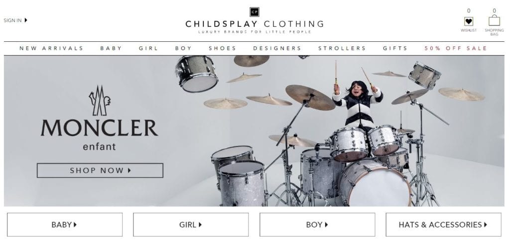
Take a look at luxury children’s retailer Childsplay Clothing is using this to strong effect. The landing page has clearly defined clickable options: Baby, Girl, Boy, Hats & Accessories. Along with this, these buttons are prominent and simple. Customers can easily click through onto the correct page to find the types of clothes that they are looking for.
Remove carousels and sliders from your site
Landing pages with large image carousels and sliders were once considered to be a great strategy for UX in ecommerce. After all, these large banners offer a wonderful showcase for your major products with impressive images. But as it turns out, it’s actually not a very good idea to have carousels on any part of your site. And for a good reason: they don’t get clicked on.
There is evidence to suggest that just 1 percent of visitors to a page will click on your slider or carousel content. And it gets worse: despite the fact that no-one clicks the images, the movement of the slider will draw the eye, meaning customers are being distracted by your carousel banners as well.
Allow ‘checkout as guest’ for best ecommerce UX
There are many reasons that it can be beneficial to get a buyer to register before completing their purchase. Not only does having an account make customer service easier, but it can also afford you opportunities for further marketing. But it seems that forcing users to create an account is actually a very bad ecommerce user experience from the perspective of getting them to convert.
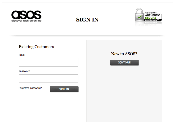
More than a third of potential customers will abandon their purchase if they need to make an account in order to buy. So, while it may be beneficial to have customers with accounts, you can’t be prioritising this over actually making the sale in the first place. Allow your guests to checkout as guests if it is the option that they prefer, but also take note from ASOS who were able to halve their checkout abandonment rate simply by making changes to the content on the account signup page.
Add site search (and make sure it works properly)
Customers expect to be able to use the site search function on your website. But you can run into problems if you don’t put enough thought into the functionality if your search feature. For example, your search should provide suggestions when a user starts typing into the bar—this can make it easier for them to find what they are looking for.
Additionally, the search should auto-correct spelling errors, and, crucially, never return failed results. Present users with popular options if there is really nothing to show for their queries.
For example, the CS-Cart eCommerce platform supports a great smart search engine called Searchanise. It has all the mentioned above features and even more.
Final thoughts…
Google’s tips for UX in ecommerce are things that every website can easily introduce to their site, and so it is definitely worth trying. Of course, it is always recommended that you thoroughly A/B test any changes to establish if they are doing positive things on your site.
 |
Chester Avey has over a decade of experience in business growth management and cyber security. He enjoys sharing his knowledge with other like-minded professionals through his writing. Find out what else Chester has been up to on Twitter: @Chester15611376. |

Yan Anderson is the Head of Content Marketing at CS-Cart with over 10 years of experience in the eCommerce industry. He's passionate about explaining complicated things in simple terms. Yan has expertise in building, running and growing eCommerce marketplaces. He loves to educate people about best practices, new technologies, and trends in the global eCommerce industry.