Go Responsive to Avoid Mobilegeddon
On April 21, 2015, Google updated its search algorithms for mobile devices. New algorithms prefer mobile-friendly websites when a user searches from a smartphone.
Websites that are not mobile-friendly disappeared from Google’s first page of search results. Forty percent of all websites were not ready for the change and started to lose traffic from smartphones. Journalists and bloggers called this event “Mobilegeddon.”
Why Mobile-Friendliness is Important
On a mobile-friendly website, menus, buttons, images, and captions match the screen of a mobile device. Responsive design is one of the ways to make your website mobile-friendly.
Using a touchscreen is less precise than using a mouse pointer. If a website is not responsive, a smartphone user has to pinch-zoom to click buttons and read text. The more actions a user has to perform, the less time he or she will want to stay on the website.
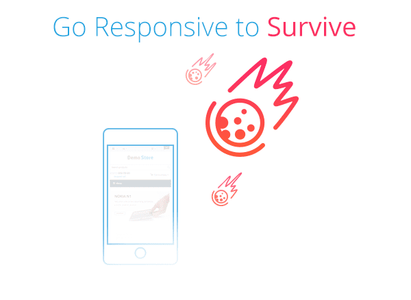
No Mobilegeddon with CS-Cart Responsive Theme
The Responsive theme makes your CS-Cart store look cool on any device:

In CS-Cart 4.3.1, all the built-in design styles are responsive. Design modifications that you make via the Visual Editor or template editor preserve responsiveness.
Thanks to the Responsive theme, Google will mark your store as mobile-friendly and rank it highly for customers searching from smartphones.
If you are running CS-Cart 4.2.4 with the Basic theme, after the upgrade to 4.3.1 you will still have the Basic theme. You can install the Responsive theme and switch between Basic and Responsive any time. We will be maintaining the Basic theme through the entire 4.3.x branch.
If you import your store from versions 2.2.x, 3.0.x, or 4.x.x to 4.3.1, your store will use the Responsive theme. The Basic theme won’t be available.
Better Yet—Twigmo Mobile Storefront
The Responsive theme uses the same styles and scripts on all the devices. Thanks to this versatility, the Responsive theme is convenient on any device.
But there’s a con: Opening a store page from a smartphone consumes nearly as much bandwidth as opening the page from a desktop computer. It’s not a problem unless a customer uses slow 3G connections.
Twigmo mobile storefront is designed specially for mobile devices. It uses less bandwidth than Responsive and consumes the bulk of it only at the first visit; after that initial visit, the storefront refreshes using AJAX. Mobile storefront loads faster and runs smoother than Responsive on slow 3G connections.
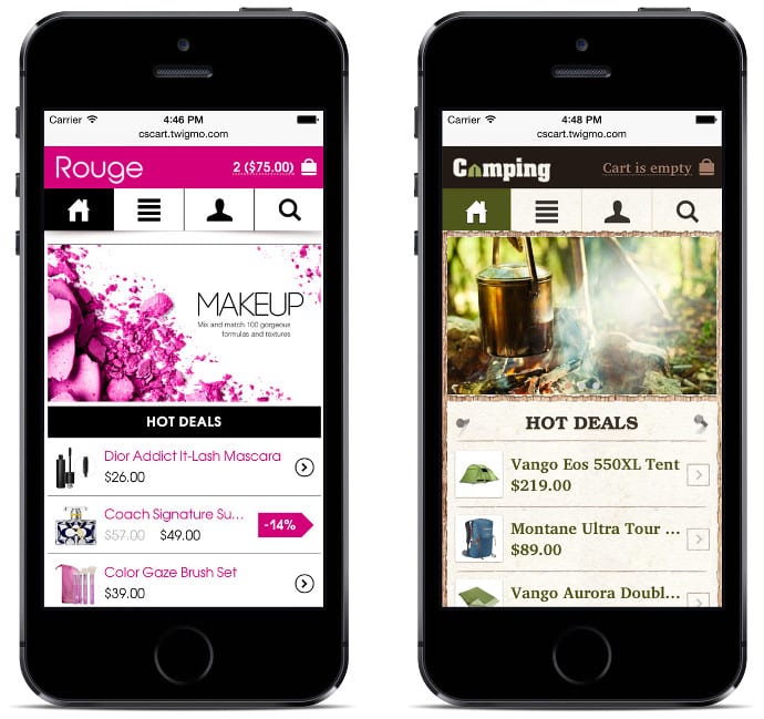
Twigmo mobile storefront offers its own themes that work independently from CS-Cart themes. It means that you can use the Basic theme for desktop computers and a Twigmo theme for smartphones at the same time. In this case, Google ranks your store as mobile-friendly even if you’ve chosen the Basic theme in the CS-Cart admin panel.
What do you think about Mobilegeddon and CS-Cart mobile-friendly solutions? We greatly appreciate your comments.
Stay tuned and follow us on Facebook and Twitter.
Follow CS-Cart news & promotions

Yan Anderson is the Head of Content Marketing at CS-Cart with over 10 years of experience in the eCommerce industry. He's passionate about explaining complicated things in simple terms. Yan has expertise in building, running and growing eCommerce marketplaces. He loves to educate people about best practices, new technologies, and trends in the global eCommerce industry.