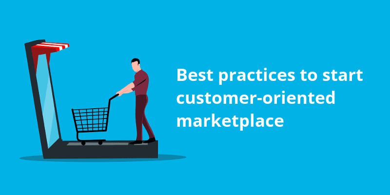
10 Tips of How to Build a Buyer Oriented Marketplace
Many marketplace businesses have appeared in the last few years. The competition is growing. To surpass competitors, entrepreneurs are trying to improve their businesses by enhancing the user experience. There are many ways to improve user experience. In this article, we will look at the terms UX and UI designs, a few ways to improve their performance, and take a glance at a buyer oriented marketplace example.
What is UX and UI design?
Since the nineties, the idea of design thinking was born and evolved. Specialists in those years began to study how a designer thinks. This idea shifted from the theoretical to practical experience. This approach was perceived as an innovative one and served to organize complex mechanisms and designs as conveniently as possible. The popularity of this approach has been growing since its creation. It is now used in various spheres from finance to IT.
There are two terms that are very close to each other in meaning: User Experience and User Interface.
User Experience is the impression that a user gets from working with any interface. The main requirement is the simplicity of achieving the purpose for which an interface was invented. The User Experience can be described as the logic of an interface. The interface must be properly designed and adapted to accomplish certain goals in a simple way.
User Interface is a set of characteristics of an interface. This is the part that determines how comfortable the design is to use. For example, how readable the text is, whether the buttons are easy to click or their placement is reasonable, and whether it looks good all together.

UX and UI is the design of any user interfaces in which usability and beauty are equally important. Today, these terms are associated with websites and smartphones, but are applicable not only in IT.
Although the profession has existed for a very long time, it did not have a specific name before. It used to be that the function of UX/UI designer was performed by an inventor himself. Let’s look at the developments of past centuries and what role UX and UI design played.
For example, the weaving loom. This machine was invented in 1785, but even then the principles of UX/UI design were applicable in the development. The inventor planned how the machine would look and work: whether a user would sit or stand, how they should press the pedals and where this pedals would be located, how many heald frames are necessary for convenience, what details should be there to make the weaving process comfortable.
Now the same planning is a common practice in different areas. Indeed, such design is applied very often in IT. This is due to the fact that developments in this area are steadily growing.
10 tips of how to improve User Experience
Let’s see what are the leading features which can help to improve User Experience and create a buyer oriented marketplace.
- Simplicity—Simplicity implies getting rid of unnecessary elements. This can also include the correct three-color scheme, empty spaces and the logical organization of a website in general. The customer should be able to understand the process from product search to delivery. Your goal is to make a marketplace clickable and informative.
The common logic of a website or marketplace is built on the principles:
- A narrow focus of content on each page. This form of content organization allows a visitor to understand what this page serves to and quickly find necessary information.
- The adequacy of design. It is important to use the already established rules and elements of design. For example, use checkboxes—a square element—when users have multiple choice and radiobuttons—round elements—when users can choose one variant only answering a question. Another example, red color for warning notifications and green for confirmation notifications. On no occasion should you do it the other way around.
- Rank information by priority. Important information should be placed at the beginning of the page, secondary information at the end, or even in the footer of a marketplace.
- Leave some space—whitespaces allow your design to look beautiful and elegant.
Use spacers in the text and separate logical blocks, elements and pictures. You can leave space not only at the top and bottom, but also on the right and left sides of the blocks and elements. Moreover, for the last few years there is a trend for minimalistic design so whitespaces help you to keep up with the times.
- Feedback learning—feedback is a very important and useful tool in design and marketing. In addition to feedback from social networks or a website, you can search for feedback on special websites, where people can find information about a particular company, see reviews and customer recommendations. Study all possible resources and highlight your strengths and weaknesses based on user experience. This will help you analyze your business and later run buyer oriented marketplace PR strategies.
- Loading time—Speed is valued on the market. If page load time and response time are not very fast, a client will simply leave your non-buyer oriented marketplace without even reaching the first step of contact with a product or service. Loading speed directly affects whether a potential customer will take shopping on a marketplace or leave it.
- The content should be useful—any text on your website or marketplace should be informative. You should not write a text just for the sake of a text. If there is a blog that adjoins your marketplace, then you have to make your content diverse. Each text should have its purpose: informative, selling, entertaining, and useful.
- Consider localization—at the first glance, localization of the user is not the most important feature to think about. However if you use localization on your website or marketplace, it may influence the language of pages, the correct display of products as well as relevant adaptation of some cultural features.
- Responsive design—in today’s world, users become more demanding of the website design. Pages should look good and be easy to navigate. Potential customers are immediately discouraged by unpretty graphic, stock pictures, unavailable buttons, and incorrect dispaly of a website. There are several types of responsive design: for desktop, phone and tablet versions. The more types of adaptations are available, the greater the audience of potential customers you can reach. As it was mentioned, your potential customers should be able to find any information easily. But without responsive design they could not do that.
- Transparency—make sure your marketplace resonates openness, clarity and honesty. While using the website, a customer should clearly understand the rules and the processes that go behind buying the product. From finding the right item to ordering and product delivery, the processes should be transparent. Forging trust between a business and its clients is important. If there is a lot of ambiguity in a marketplace, users are likely to leave a page. When buying something on the internet, people are looking for clear and problem-free experience, and your marketplace should make them feel that this is what they are going to have.
- Password-free experience—using passwords to enter your account is a familiar method used by many marketplaces, but not the most secure one and according to the recent research boring to users. Password-free approach is one of the new trends of recent years. It has gained popularity because people have become tired of the large number of passwords that they have to remember. Passwords can be replaced by other authentication methods. Push-authentication is one of them. It means that when you reply to a secure push notification, the login on the second device is done automatically. Another one is the adaptive authentication that takes into account location, time, IP address, and device type. Password-free authentication happens through biometric data such as fingerprints or face recognition.
- User research—user research is important for running a successful buyer oriented e marketplace. It is more than just a feedback. Learn more about the interests of your customers, preferences and experiences. Use all available tools for that, such as surveys and direct communication. This is an excellent and sometimes underrated way for interacting with your target audience.
| The main idea of UX and UI design: look from the user’s point of view |
Buyer oriented marketplace example
A primary example of a buyer oriented marketplace is Precious Plastic Bazar. It is simple, minimalistic, and good looking. The main feature of it is that there are no unnecessary elements. It has a clear structure of product categories, basic localization, and convenient ordering. It follows simple logic of UX and UI designs. It is not overflowing with bulky elements which make it appealing for people.

This marketplace was made on the CS-Cart Multi-Vendor platform. It is one of the leading platforms which allows for creation of a website for all tastes and types. As a platform has an open code and more than 2,000 add-ons for usage, it does not limit a business. It is an on-premise platform with one-time payment methods. There is also a buyer oriented marketplace app for Android and IOS is available. You can try a free demo and create your demo marketplace.
Summary
All in all, creation of a buyer oriented e marketplace is not as difficult as it may seem. You have to take into account preferences of your target audience and maintain logic on each step of the sell and buy process. All these steps can influence the efficiency of a business and help to build relevant buyer oriented marketplace PR strategies.